
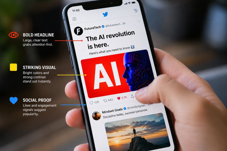
People form an opinion about a social media post within seconds, often before reading a single word of the caption. Visible engagement counts, the number of likes, replies, and reposts sitting beneath a post, act as a fast signal of trustworthiness. This is sometimes called social proof, a term researchers use to describe how people look to others’ behavior to decide how to react themselves.
Some platforms and third-party services have built entire products around this instinct, offering ways to increase a post’s visible numbers and give it a stronger initial appearance of popularity. For newer accounts or campaigns trying to gain visibility, buying social engagement can sometimes be used as a promotional tactic to create social proof and help content appear more established.
Learn more about buying social links, but approach this tactic with caution. Purchased engagement should still be approached carefully, since inflated numbers do not necessarily reflect genuine audience interest or long-term interaction. Visual design, by contrast, remains something every account holder can control directly and use to make posts more appealing to real viewers.
Human vision processes layout and color faster than it processes text. Research from the Nielsen Norman Group, a longstanding user experience research firm, has repeatedly found that people scan digital content in predictable patterns, picking up on visual weight and placement before comprehension of the actual words begins. On a platform like X, formerly known as Twitter, this means a post’s structure, image, and formatting are doing persuasive work well before the caption registers.
This scanning behavior explains why two tweets with identical text can perform differently depending on how they look. A cluttered layout or a blurry image creates friction, and friction reduces the likelihood that someone stops scrolling long enough to read further.
Contrast refers to the visual difference between elements, such as text against a background or a subject against its surroundings. Findings from the Nielsen Norman Group and separate accessibility research published by the World Wide Web Consortium (W3C) both point to the same conclusion: low contrast content is harder to process and more likely to be skipped, particularly on small mobile screens where most social media consumption happens.
On X, this plays out in a few practical ways:
Visual hierarchy is the arrangement of elements so the most important information is seen first. In a tweet, this might mean a bold opening line, a clean image with a single focal point, or a thread structure that previews the payoff before asking for a click. Studies on eye tracking conducted by Nielsen Norman Group describe an “F shaped” reading pattern for text heavy content, where attention drops sharply after the first few lines. Writers who front load their most compelling point tend to retain more readers than those who bury it.
Hierarchy also applies to images. A photo with one clear subject reads faster than a busy frame with competing focal points, and that speed of comprehension matters in an environment where users decide to keep scrolling in a fraction of a second.
Resolution and composition are separate from contrast and hierarchy, but they compound the same effect. Data from Twitter’s own research blog, published before the platform’s rebrand to X, found that tweets containing images received meaningfully higher engagement than text only posts. Later industry analyses from social media management platforms such as Sprout Social have continued to find that visual content outperforms plain text across most social networks.
A grainy screenshot or a heavily compressed image signals low effort to viewers, even if the underlying idea is strong. Clean, well lit, properly cropped images tend to read as more credible, independent of anything else on the account. These patterns are not unique to X, either. On visually driven platforms such as Instagram, similar dynamics shape engagement on other visual platforms, where layout, color consistency, and image quality work together to build the same kind of instant credibility.
It is worth being direct about a distinction that often gets blurred. A well designed post earns attention because it is genuinely easier to look at and understand. Inflated like counts, by contrast, borrow the appearance of popularity without the underlying substance, and platforms including X have policies against inauthentic engagement for this reason. Accounts that lean on purchased numbers risk inconsistency between their visible stats and their actual reach, which can undermine trust once an audience notices the mismatch.
Design, unlike purchased engagement, compounds honestly. A creator who consistently applies sound contrast, clear hierarchy, and quality imagery builds a visual identity that readers come to recognize and trust over time. That kind of credibility does not require a shortcut, it requires attention to a handful of principles that are freely available to anyone willing to apply them consistently.
As visual platforms continue to reward content that is quick to parse, the accounts that invest in genuine design fundamentals are likely to see that effort reflected in how real audiences respond, not just in the numbers displayed beneath a post.