How Graphic Design Shapes Instagram Influence: From Layouts to Likes
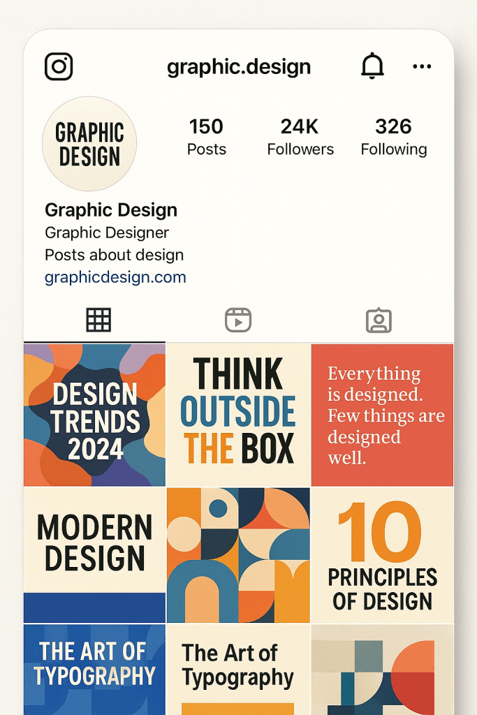
 Scroll through any popular Instagram profile, and you’ll notice a common thread—cohesion. It’s not just about the subject of the photos or how attractive someone looks. It’s the grid layout, the color palette, the consistent typefaces, and the way everything feels like it belongs together. This is where graphic design steps in. For influencers, design isn’t just decoration—it’s strategy.
Why Cohesion Matters
First impressions count. When someone lands on an Instagram profile, they decide within seconds whether to follow or keep scrolling. A cohesive aesthetic signals professionalism, clarity, and purpose. A scattered or inconsistent feed, on the other hand, feels chaotic and harder to trust.
Cohesion isn’t just about looking pretty—it’s about helping the viewer understand who you are and what you’re about. Are you a fashion influencer with a minimalist style? A wellness coach sharing earthy, calming tones? A food creator with bold, saturated colors? That consistency builds recognition, which builds trust, and trust is what keeps followers engaged over time.
Color Schemes That Speak
Color isn’t random. Influencers and designers frequently utilize color psychology to evoke specific moods and emotions. What matters most is consistency. A strong, recognizable color scheme tells the brain, you’re in the right place. Whether it’s soft neutrals, bright pastels, or high-contrast blacks and whites, a defined palette gives your feed a signature look. Tools like Adobe Color or Canva’s palette generator help creators lock in their aesthetic early and stick to it.
Beyond emotion, color also plays a practical role. Using the same accent color for text overlays, highlights, or buttons helps guide the eye and reinforces brand identity. It also makes individual posts feel like part of a whole.
Grid Layouts and Flow
Instagram is built around a grid, and savvy influencers utilize that layout to their advantage. Some use a checkerboard pattern (alternating image and text posts), while others opt for a row-by-row storytelling approach, where each row focuses on a specific topic or mood. There are diagonal flows, puzzle feeds, and even carousel tricks that use split images across multiple tiles.
The point isn’t to get fancy for the sake of it. It’s about creating visual rhythm—something that makes people pause, explore, and engage. A well-designed layout makes your feed more scannable and memorable.
Grid planning apps like UNUM or Preview help creators see their layout before posting. This allows them to curate not just each post, but how the posts work together. It’s a shift in thinking: each image matters, but how it fits into the larger issues of the puzzle just as much.
Typography and Graphic Elements
Text overlays, quote graphics, and story highlight covers are subtle design elements that reinforce identity. Using the same fonts, sizes, and styles consistently across content establishes your brand’s voice. It adds structure and makes the content easier to consume.
Even simple elements, such as borders, drop shadows, or spacing, can significantly influence how credible and straightforward a message appears.
Templates also play a significant role. Many influencers utilize repeatable formats for various types of content, such as announcements, lists, or promotional materials. That repetition makes followers more likely to recognize and remember the message.
The Psychology Behind Aesthetic Consistency
A consistent aesthetic taps into a few psychological principles. The first is fluency—our brains prefer content that’s easy to process. When posts follow a visual pattern, we can make sense of them faster. That’s part of why people “like” consistent feeds more, even if they can’t explain why.
Then there’s association. When a follower sees a particular color or layout and connects it with a specific creator, that design becomes part of their brand memory. Over time, even just glimpsing that visual style can trigger recognition, and that’s powerful for retention.
There’s also emotional coherence. Design can evoke emotion, and when that emotion aligns with the influencer’s message, it creates a more substantial impact. Imagine a mental health advocate using soft, pastel tones that evoke a soothing atmosphere. Or a travel creator using high-contrast, sun-drenched visuals that inspire adventure. The visuals and the message reinforce each other.
Engagement Through Design
Good design doesn’t just look good—it drives action. Posts that are clean, clear, and emotionally aligned tend to get more likes, shares and saves. When users know what to expect from your content, they’re more likely to engage with it.
Stories, reels, and posts that follow a recognizable visual format are also watched for longer. It’s not just about catching attention—it’s about holding it.
In short, design turns casual views into lasting followers.
Final Thoughts
Graphic design is more than a background detail on Instagram. It’s the foundation of how influence is built and sustained. From grid layouts and color palettes to typography and templates, every design choice contributes to shaping perception. And that perception leads to action—whether it’s a like, a comment, a follow, or a sale.
For influencers serious about growth, design isn’t optional. It’s part of the strategy.

 Scroll through any popular Instagram profile, and you’ll notice a common thread—cohesion. It’s not just about the subject of the photos or how attractive someone looks. It’s the grid layout, the color palette, the consistent typefaces, and the way everything feels like it belongs together. This is